

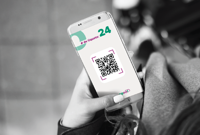
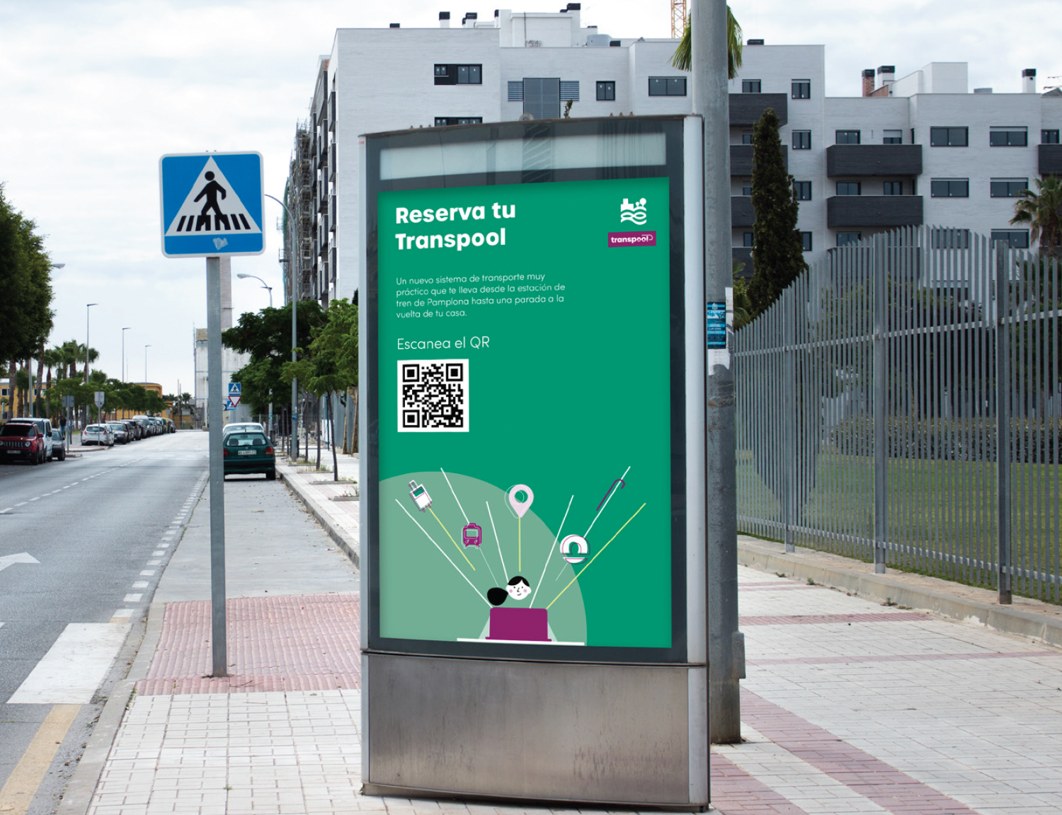
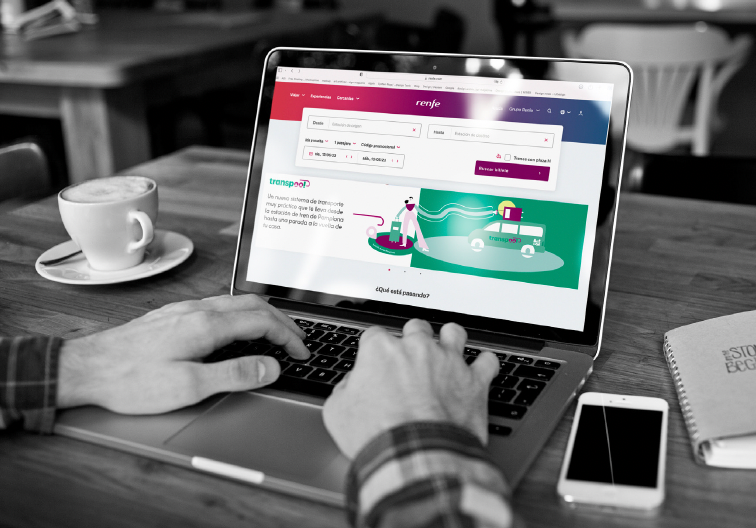
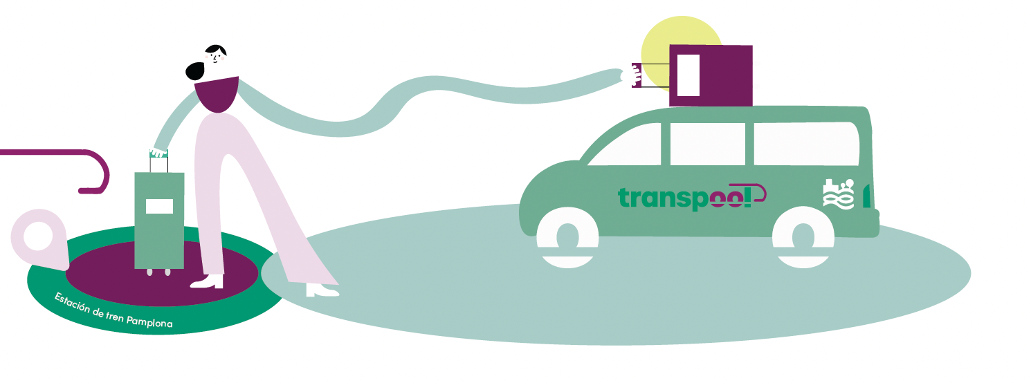
A new, very practical shared transport system that takes people from the Pamplona train station to a stop just around their house.
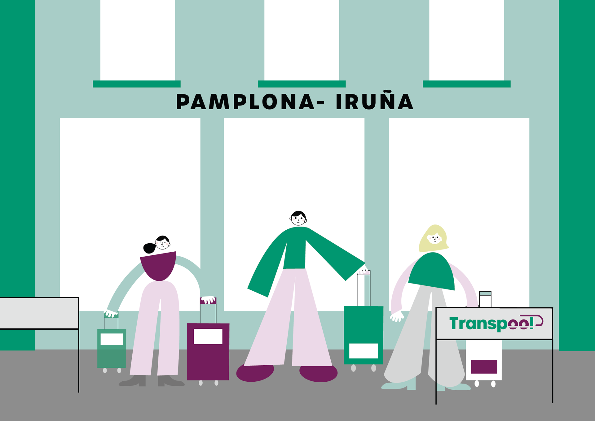
A huge problem that Pamplona faces is the transport in the train station, there 's a lot of uncertainty regarding how much time users need to wait, there are just a few taxis, bus is not an option with bags and the waiting zone lacks of seats and a ceiling when weather conditions aren't the best. Making this a headache for all the users that wish to have assurance that as soon as they go out of the station there will be a car waiting for them.
CHALLENGE
How might we help Cristina, jaime and Juanita to get out of the station faster, more comfortable and efficient way as possible?
proposal
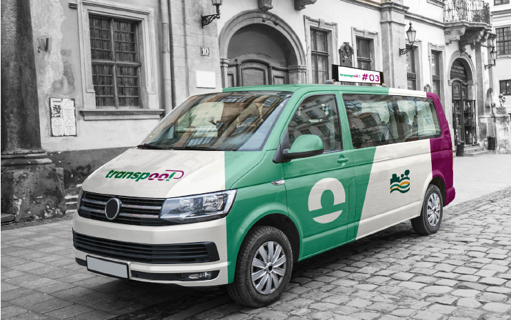
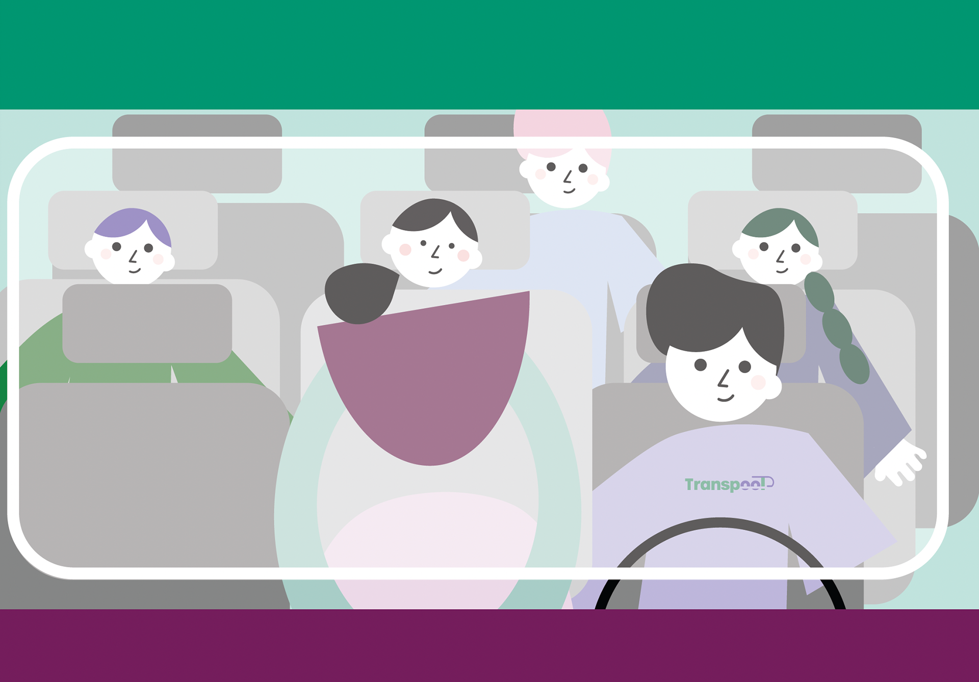
Through a collaboration between Renfe and the Mancomunidad of Pamplona: Transpool, with 10 vans that connect to the train station with stops that turn on and off depending on the need at that moment. With this, the purpose is become a hybrid service between buses and taxis. We don't do a door to door like a taxi but the user doesn't have to wait an entire journey of a specific route to reach his destination.
Mission
Provide an excellent transportation service designed to expedite the flow of people in the train station that is more practical, sustainable and economical. We are committed to offering a high-quality service that meets the needs of our customers providing them a stress-free transportation experience.
vision
To become the market leader in efficient and practical transport solutions for rail travelers and thus welcome all travelers to the city.
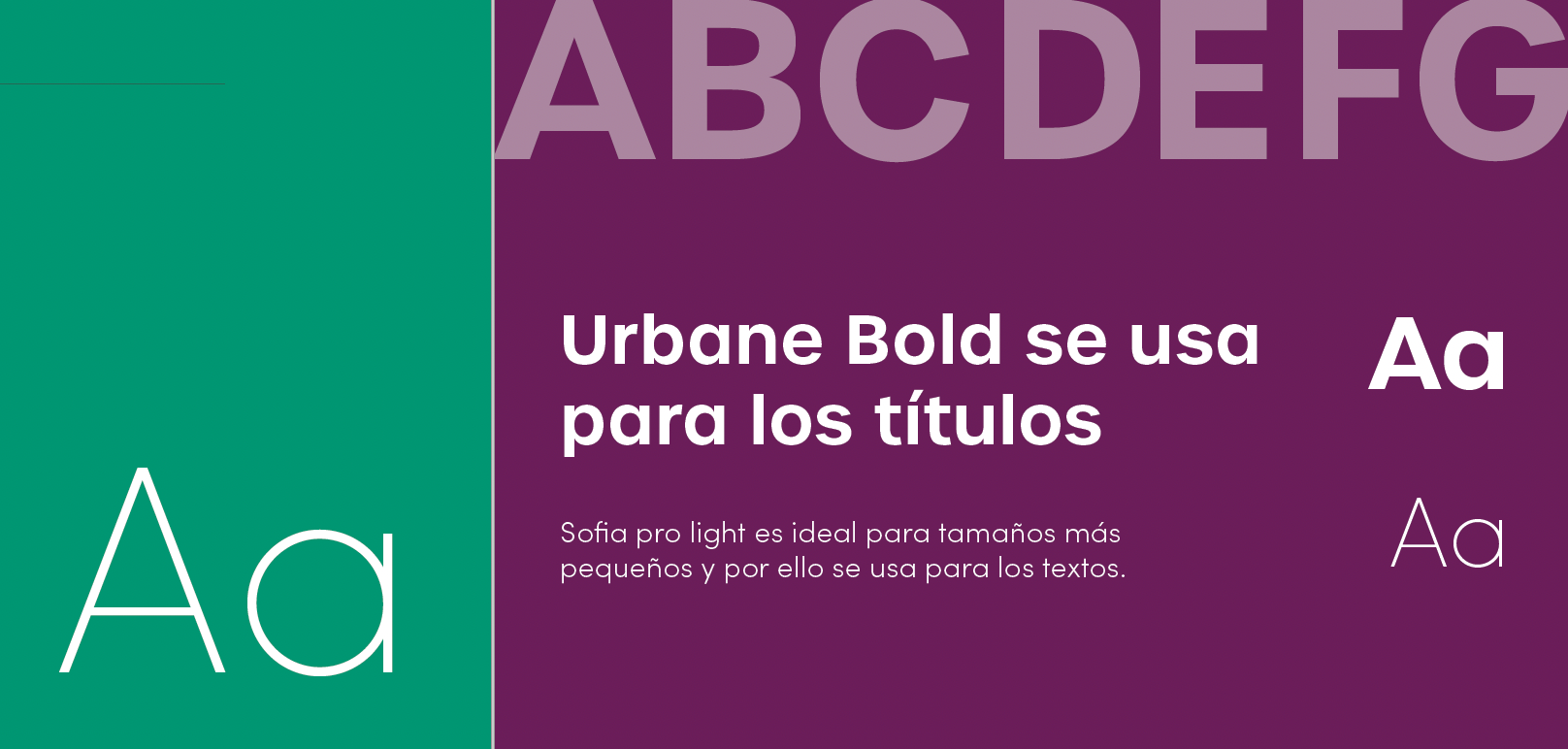
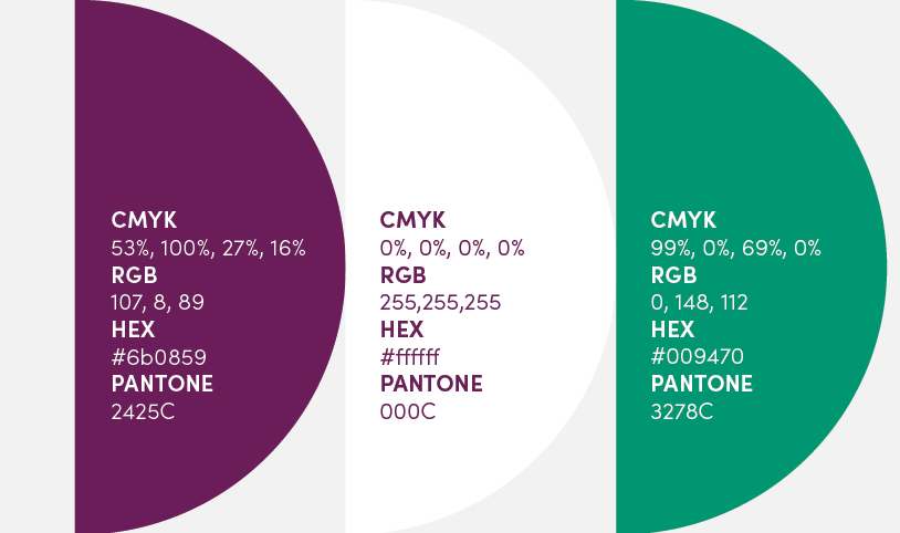
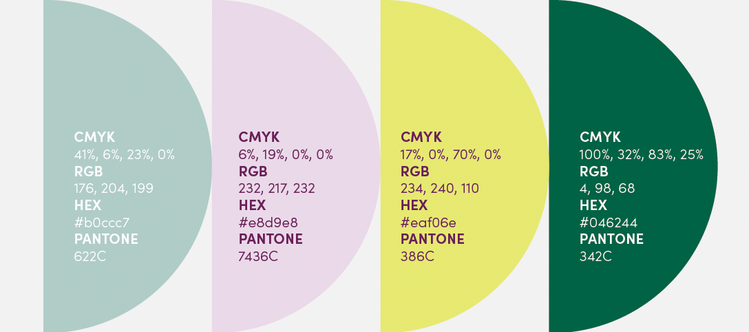
visual identity
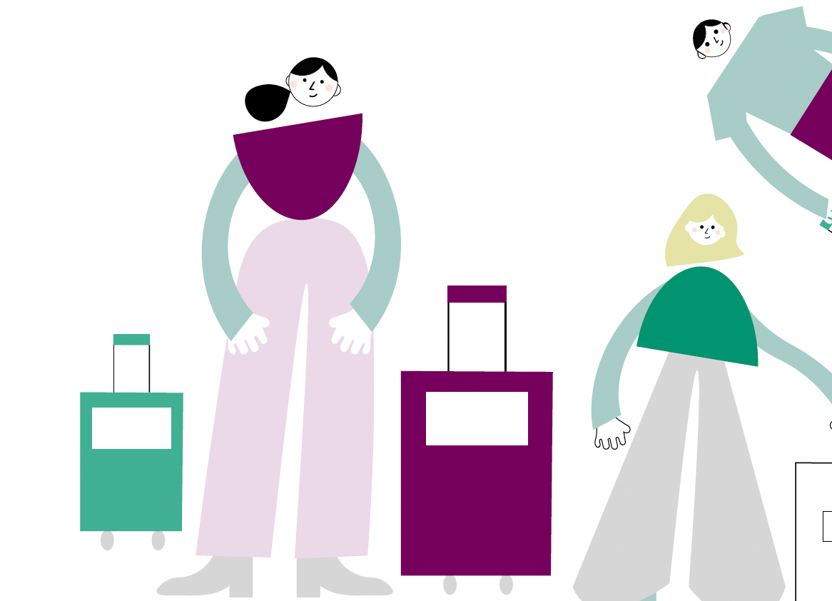
The brand identity is inspired by the connection between the Mancomunidad of Pamplona and Renfe. It features a color palette that references both entities and incorporates geometric shapes from the Mancomunidad logo to evoke movement. The illustrations are modern and friendly, designed to reflect the comfort of the service.
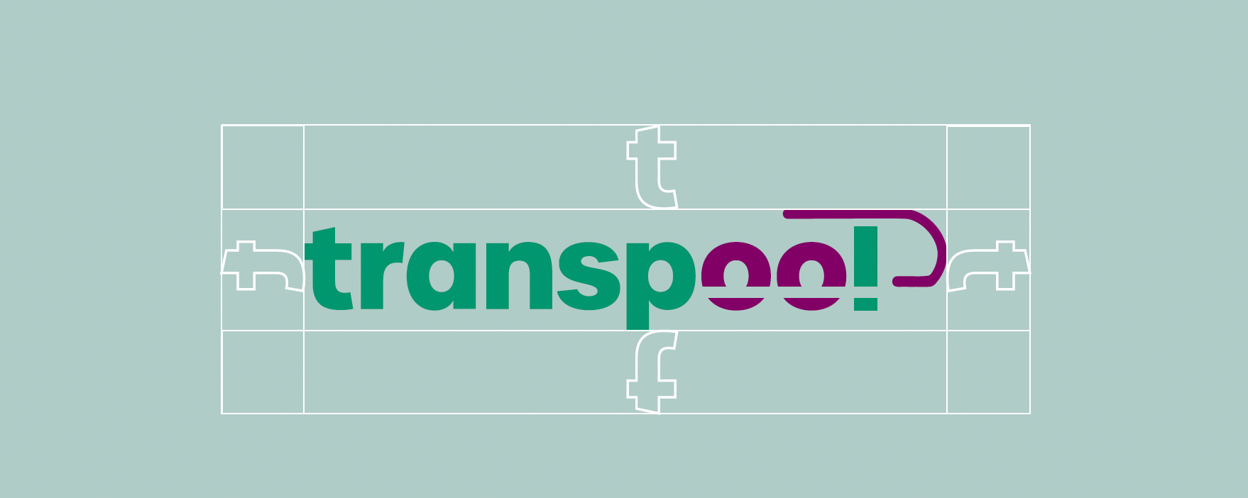
Concretely, the logo with the two "o"s in Transpool serve as wheels to represent this new transportation service, combined with shapes that reference the service from the train station through the dark magenta line on top of the 'o' and the 'l'. All of these elements combined, make our brand have an approachable and clean style.


//credits (member of the team) : Daniella Hanabergh